

Macro view of the Four
How to spot the difference between algorithms by using scatterplots

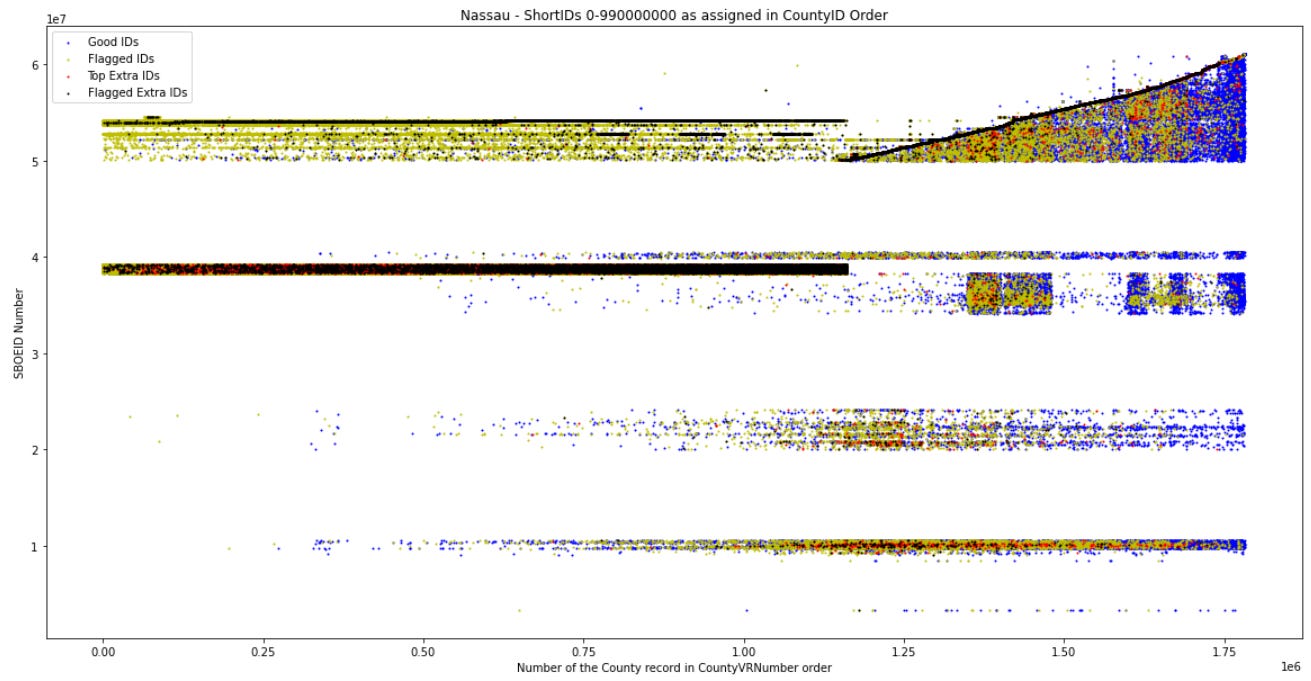
The last post here on the ZarkFiles ended with four diagrams that showed how the four algorithms found in New York’s voter rolls are constructed. This morning, I decided to add images that show the final result.
The first image (figure 1) shows all of Nassau County’s voter ID numbers in one scatterplot. N…
Keep reading with a 7-day free trial
Subscribe to The Zark Files to keep reading this post and get 7 days of free access to the full post archives.